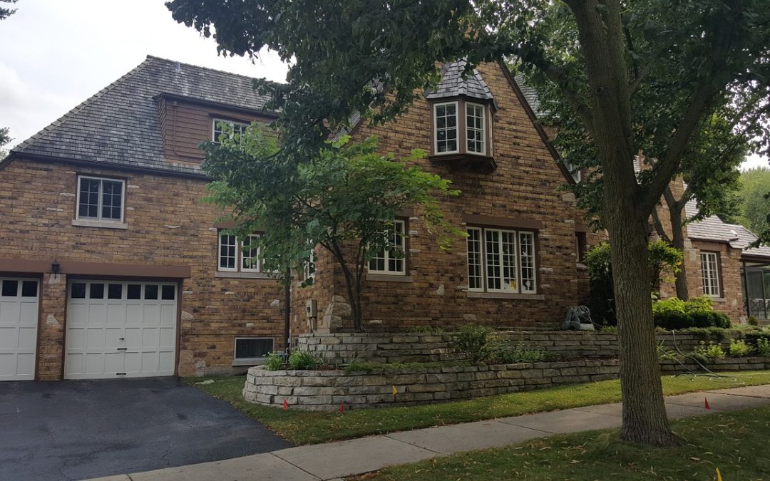
In real estate sales, curb appeal is crucial. The square footage of the home, the refinished kitchen, and the school district may be great sellers, but if the paint is peeling and the sidewalk is overtaken with weeds, few potential buyers will take the time go inside, let alone make an offer.
The same goes for your website content.
You may have an excellent message, one that contains all the right elements (enticing headline, compelling intro paragraph, description of benefits, and a strong call to action), but if it’s hidden in a drab web design or expressed in an obnoxious font, who is going to read it?
It’s time to dress up your web content and increase that curb appeal. Here are a few tips to help you add sparkle.
Think twice about stock photography
Stock photography is easy to come by and inexpensive. However, you are choosing from the same images as everyone else, which means the images on your website may be very similar to your competitors. Look at this photo of the young woman with a head set.

It’s a great photo and one that suits many businesses well. The problem is that many businesses use this photo or one similar to it.
The best option is to hire a professional photographer to take real life images of your business. But if that’s out of the budget, work with a graphic designer who can modify stock photography to match your brand.
Pay attention to length
An ideal length for a web page is somewhere between 200-300 words. However, some pages will be much shorter (e.g., contact us) and other pages will be much longer (e.g., about us, resource articles). Be kind to your readers and allow them to get through a page of content quickly. Sentences and paragraphs should be brief and you should incorporate lists, sub-headings, and other formatting to break up the text.
Interest the reader
Minimize industry jargon and cliché statements. These words slow down the reader and make it difficult to scan (what a website visitor really wants). Keep the text easy-to-read and add a few unexpected nuggets of text.
Not sure what I mean? Try reading this sentence:
“Using sophisticated twenty-first century computer technology, ABC Company’s team of expert-trained software engineers create state-of the-art network systems.”
If a page of web content were a house and a sentence was paint, the above sentence is peeling and the house needs a new coat. Try this sentence instead:
“ABC Company creates advanced network systems that replace inefficient technologies.”
Text formatting don’ts
- Don’t go too big. Keep the font size reasonable (11-12pt).
- If you are going to use a different color font, keep it to a minimum. Only introduce one or two colors and use sparingly.
- Stick with one or two font types. It’s distracting to look at multiple fonts.
Links, links, and more links
It’s important to incorporate links on each web page, so the visitor can easily navigate the site. The hyperlink color is nice for breaking up text too. But again, don’t over do it. Too many links can confuse the reader on what to do next. Use less than three links within each page of web content (not counting links in your header or outer columns).
Web page design
Work with a website designer to create web pages that are easy to read. Namely, choose a design that includes columns, which help to break up text and improve ease of navigation. Design elements such as pull out quotes and text boxes also make it easy for the reader to scan the page. Most importantly, though, are images. Photos and a logo will take your site to the next level.
These are just a few examples of how to improve the curb appeal of website content. What tactics do you implement to make your copy sparkle?


