Today we’ve got a guest contributor here on The Condiment Marketing Co. blog — Brittany Hass, the Art Director from Studio Pattern in Denver. In addition to being an expert in print and web design, Brittany knows a great deal about photography and has directed many photo shoots.
Ideally you have an art director on payroll to ensure you’ve got consistent, professional, and brilliant product photos. If you don’t, it is up to you to act as the art director. Follow Brittany’s tips to learn how.
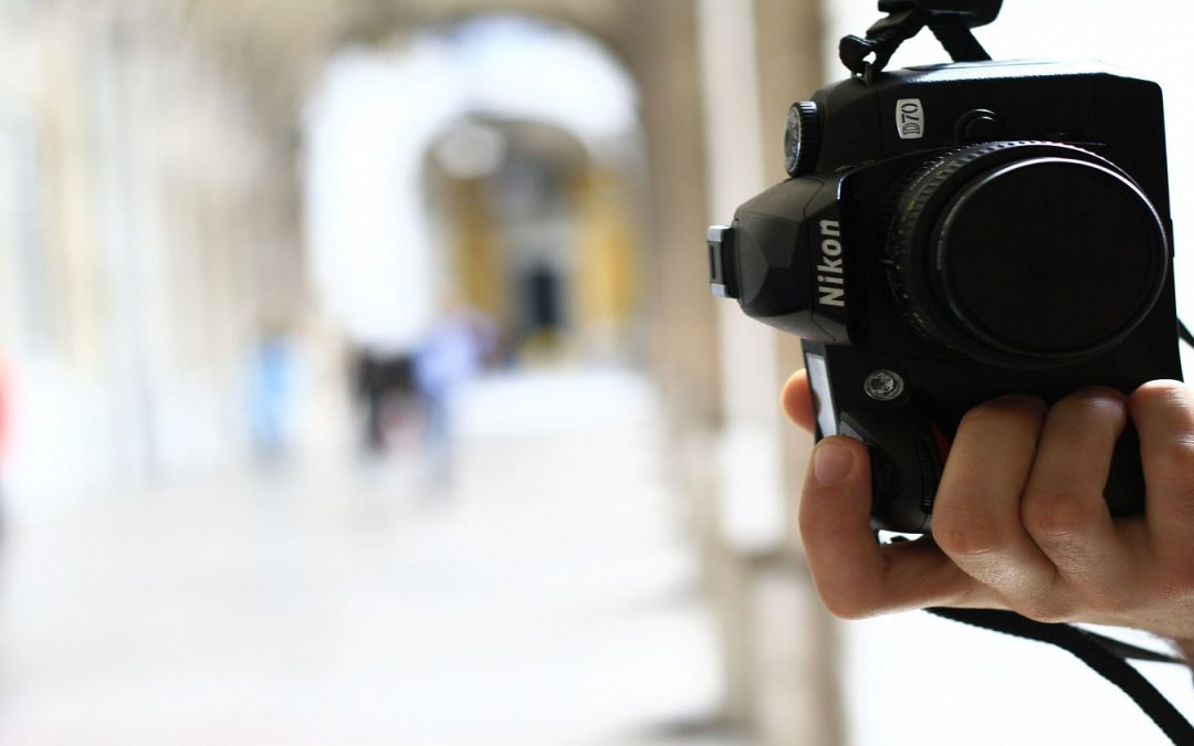
1. Choose natural light (outside or inside with lots of windows).
Consumer level flashes almost always make things look terrible, flat, amateur, and did I mention terrible? Outside light on a cloudy day or sometimes in shade is better than direct sunlight, which can be much too harsh. If you pick a distinct time of day (sunrise and sunset both provide beautiful light), try to shoot at the same time of day with the same setup/angles each time.
2. Decide on a style and stick with it.
Some products look best “in situ” (i.e., a beer on a bar counter or massage oil in a spa setting) and others look best on white, cut out, or on a plain background. Both can look professional, but until you really get going with photography it is best to have one or the other for a coordinated look.
3. Reduce distractions.
You don’t want to see unintentional texture, dirt smudges, forgotten socks, or anything else on or around your product. These will have to be edited out, which adds to your post-editing costs.
4. Manage reflections.
With product photography there are often shiny parts (beer cans and bottles are notorious for this). If you’re shooting on a white background, you almost need the product in a white light tent that has only a tiny hole for the camera lens to poke through — otherwise you’ll have an unintentional self-portrait on your bottle. Even abstract reflections of your light sources or other objects in the shoot can be distracting.
5. Think about color theory, but not too hard.
In dated food photography you’d often see a yellow curry in a crayola-colored blue bowl, or a red salsa in a festive green one. These can make the foods look colorful and fresh, but it’s often too much. Many foods look great on white or light/unobtrusive colors. Many dishes that people actually use in their homes are light colors, so this feels more familiar anyway.
6. Consider depth of field.
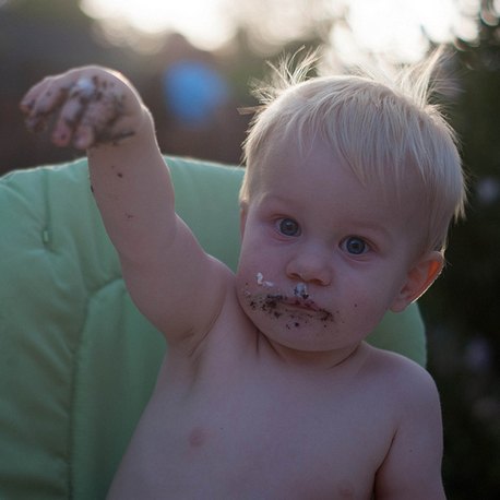 My preference is for a short depth of field, which means that part of the image is in focus and part of it is blurred out. (Take this picture of my son as an example of short depth of field). This can help food look more appetizing, since you can focus on the beautiful curl of parsley instead of the greasy sauce on the pasta.
It also helps focus attention on the food rather than the tablecloth, silverware, or whatever else might be in an in situ picture. Again, this is a style thing, and you need to pick one style and stick with it.
Some food publications shoot everything from directly above so you can see the colors and nothing is hidden. This is great for cookbooks where people want a pretty specific idea of what is in the dish. But it doesn’t necessarily make mouths water the way selective-focus or short-depth-of-field photography can.
***
To learn more about Brittany and Studio Pattern, check out the company’s Facebook page.
About Sara Lancaster
Sara is The Condiment Marketing Co.’s founder and creative director. She oversees client relationships, strategic marketing plans, as well as a bit of copywriting and social media management.